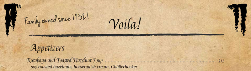
Options to customize the look of your menus.

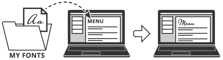
iMenuPro features over 80 typefaces that comprises over 200 fonts from the world's top type designers. The fonts have been carefully chosen by graphic designers to enhance and work with restaurant menus.

Each Menu Style has preselected fonts referred to the Style defaults. These fonts have been chosen to work together with the design, artwork, and layout of the Menu Style. You can override these font selections, however, and make your own for any Menu Style using the Fonts menu.
Under the Fonts menu choose which Font you want to change (Normal Heading, Food Item Name, etc) and the Font box will appear. As you make changes in the Font box, you'll see the new font updated in the Sample box. At any time click the Use Style defaults button to return to Style default for the font. When you're ready, click OK and your newly selected font will be applied to all elements of that type on your menu.
The following options are available in the Font box:
The name of the font.
Sets the weight (regular, bold, etc.) and whether the font is Italicized (regular or italic). Not all Font Families contain all font styles - some fonts will not allow you to italicize or bold the font.
The font size (in points)
The letter Spacing - spacing in between the characters of a word. To expand the spacing choose a value greater than 0. To compress the spacing choose -1. For normal spacing use 0.
The color of the font.
Tip! Hey, where's my font? If your menu style has solid box type accent, and the font color is white to make it pop off the accent, and you remove the accent and your menu paper color is white: the font will now be most invisible. Simply change the font's color to something other than white to bring it back to life.
Underlines each character in the text.
Puts a line above each character in the text.
Capitalizes each letter.
Outlines the letters in the chosen font color and turns the inside of letters white or, for some styles, a specific color that goes with the style.
Adds a slight shadow to the letters. Shadow size and color are based on the chosen style - mostly the color is a typical grayish shadow.
Use this command to decrease all heading and food item font sizes at once. This command is also available via the tool-bar for quick access.
Use this command to increase all heading and food item font sizes at once. This command is also available via the tool-bar for quick access.
If you have made changes to more than one font, and want to Reset them all back to Style defaults at once, use the command Fonts > Reset fonts to Style defaults.
The Custom Font Uploader lets you upload your own TTF, OTF, or WOFF fonts for use on any menu. For example, if you own or license a font that you use with your branding or marketing materials, you can upload that font and use it on your menus as well, to keep your branding consistent.
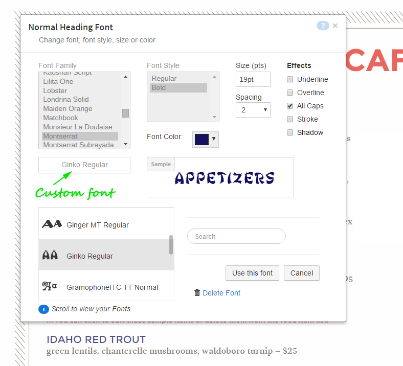
You can upload a font by clicking the Upload Font button or browse previously uploaded fonts in your font collection by clicking the browse Custom Font box which is directly below the iMenuPro Font Family list.
To remove a font and return to the iMenPro font, click the red Remove button when it appears.
To Delete a custom font, browse to your custom fonts by clicking the browse Custom Font box and select the font you want to delete from your custom font list. Then click the Delete Font link and confirm the delete. Please note, once a custom font is deleted, if it was used on any other menus, it will be removed from those menus as well since the font will no longer be in the system.
NOTE Before uploading a font, you’ll want to make sure that your font is appropriately licensed for use in other applications. If you do not own the font, or its not properly licensed to you, do not upload the font. If you receive a message during upload that says the font is not appropriately licensed, try uploading a WOFF version if you have one. If not, contact the font vendor that distributes the font to obtain one without Restricted License Embedding.
Color fonts (also known as Multicolor fonts) are a new, exciting evolution of digital typography that is now supported by iMenuPro.
Most normal fonts do not hold color information - you choose the color manually in the app and the fonts are rendered in that color. Color fonts, on the other hand, contain color information, and usually multicolor information, in the font itself. This new technology has allowed font designers to bring rich graphic features like color patterns, gradients, and textures right into the font itself, allowing for some rather dramatic results.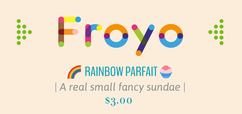
Example of the color font Color Tube used on a menu
With iMenuPro's Custom Font Uploader you can now add color fonts, like Color Tube, to your menus. Since color font technology is new, many of the fonts from emerging designers are given away free under the Creative Commons license. If you're a premium account user under iMenuPro, all you have to do is download the font, then upload it into iMenuPro.

Color Tube color font

Bixa color font

Fattern color font
Simply download the fonts you want, and then upload the OTF font files using iMenuPro's Custom Font Uploader.
Note Color font technology is currently supported by most of the major browsers, with the exception of Google Chrome and Microsoft's new Edge. In Chrome/Edge you'll see the font as if it were a normal non-color font. But even if you use Chrome or Edge, the iMenuPro PDF menus will still render your menus with the correct colors for the color fonts.
iMenuPro offers a selection of over 500 backgrounds and watermarks. Some Menu Styles use a background, some do not, but you can add any menu background to any menu (or change the page color) using the Design > Background command.
The following options are available:
The name of the background - after selecting, a live preview will appear on your menu. To remove the background from your menu select (none).
The distance between the edge of the paper and where the background image starts. For example, if want the background to cover the entire menu, enter 0. If you want the background to start at 1/2 inch from the edge, enter 0.5.
If this box is checked, the background image will be stretched to fit the dimensions of your menu. Unchecking this box will allow the background image to be sized proportionally to the image's own dimensions. This can be useful if you have a custom size menu, such as a square menu, and the background image is rectangular - by unchecking this box you'll avoid the distortion that might occur if the rectangular image is stretched to fit into the square menu.
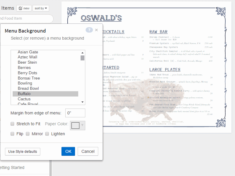
Check this box to flip the background vertically.
Check this box to flip the background horizontally (creating a mirror image).
Check this box to lighten the background image in tone.
You can add an Instagram® type filter to any background image.
Sepia: Travel back in time with our twenty-three year old Westworld legacy code.
Grayscale: When you feel grey and want to feel a bunch of shades greyer.
Monoblue: Deep blue monochrome. For turning solid colors mostly white with image parts blue.
Invert: Atari Breakout colors. It’s not for everyone, but it’s definitely for someone.
Duopaper: A Duotone that melds the current paper color with the background image color.
You can also have a plain paper color as your background. To do so, select (paper color) as your Menu Background and then choose a color from the color box.
At any time, click the Use Style defaults button to use the Style's default background.
Tip! The background gets applied to all pages of your menu. If you want to remove it from a certain page, you can do that by covering it with a simple white box. Here's how: Insert the Artisan image Graphic Illustrations > zzBox and colorize it to pure white (or whatever you want your background color to be).Then, once it's on the menu edit its dimensions to the be exactly the same as your page size. Finally right-click the image and select Underneath Text to push it underneath your text as a background.
"Well, sir, it's this rug I had. It really tied the room together."
The Dude
Like "the Dude" says in the The Big Lebowski, a single accent can really tie a menu together.
Accents are a collection of graphic design elements that do what they say - draw attention to (or 'accent') menu headings or food items.
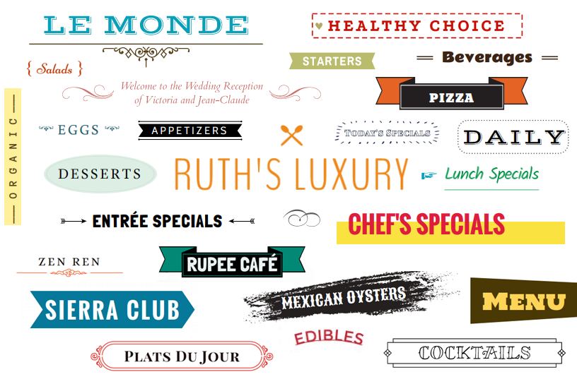
iMenuPro offers various types of accents to cover any type of menu - from casual to elegant - all of which can be colorized to any color to match your design. Some Menu Styles use accents, some do not, but you can change accents on any menu.
Example of Vintage Title and Banner accents on Headings
Heading Accents are preset for each Menu Style - some styles use them and some do not. To override the Menu Style heading accents for all headings of a particular type, use the Design > Accents command. Changing the heading accent with this command changes all Heading Accents of a particular heading type for any menu heading that has its accent set to (style).
To change only a specific heading's accent, edit the heading itself and choose the Accent and color under Accent. To remove an accent for a specific heading, edit the heading and choose Accent (none).
The following options are available:
The Accent itself. To remove all Heading Accents for the heading type, choose (none).
Check this box and then choose a color from the color selector to colorize the accent. Note: If the original accent has more than one color, this option applies a monochrome colorization to the accent.
These selectors allow you to adjust the relative width and height of underline/overline accents for food items and graphic boxes that surround a single or multiple food items.
At any time, click Use Style defaults to use the Style's default Accent options.
Tip! Some divider Accents are available for Title Headings only as they are just too tall for Normal headings. Also, some Accents like the overlines, the rooster, the flower, etc. appear on top of the heading instead of below it. If the accent you want doesn't fit your menu, try using the Before/After spacing to give the menu text more breathing room.
Example of Curved Text and Ornament accents on Headings
Layout options are advanced options that let you get under the hood to fine tune your current menu style. You can adjust column spacing, change the description and extras indents or bullets, and change the line spacing within menu text, etc. Layout option changes are applied to your entire menu.
You can adjust the space between columns, shrink the left or right column, or tweak the line that can appears between columns.
Sets the space between the columns. Applied to all columns on your menu.
Check the box if you want a line to appear between any columns, and then use the line options to choose the type of line you want.
Lets you shrink the left or rightmost column width to create uneven (unbalanced) column widths. Applied to overall menu style columns only, not to food columns.
Sets the column line thickness in pixels.
Sets the column line type which can be a solid, double, or dashed.
Uses a shorter line between the columns. Because sometimes in life, what you need is a shorter line.
Sets the column line color.
These options affect the Description and Extras for indents and bullet separators.
Sets the left indent for the food item descriptions (and extras) that appear on the 2nd line and beyond, relative to the left page margin and for non-centered Menu Styles only. If you want different indents for the descriptions and extras, enter the description value first, followed by a semi-colon, followed by the extras value. For example enter 0.2;0.35
Sets the right indent for the food item descriptions (and extras) that appear on line 2 and beyond, relative to the right page margin, for Food Layout > Left styles only.
Sets the description bullet (the character that separates the description from the food item name). To remove the description bullet choose none.
Sets the extras bullet (the character that appears before the extras text). To remove the extras bullet choose none.
Sets the spacing before the extras. The style default here is normally 0, but you can add extra space here if you feel the extras are too close to the descriptions based on the fonts and style you are using.
Sets the left indent for food item names to the specified value (has no effect on centered items).
Sets the relative size of photos that are attached to food items on the menu.
Sets the general layout alignment for the food items on the menu - either Left, Center, or Right.
This option works together with Food Layout for Left or Right layouts. Choose whether you want the description to start on the 1st line, i.e, the same line as the item Name, or the 2nd line, the next line below the Name. For centered layouts, the description always starts on the 2nd line.
Sets the overall line spacing within the food items and headings themselves (and also between them) for the entire menu. This differs from Page Spacing which is only used to add or remove spacing between food items and headings. The normal line spacing is 1.0 for most Menu Styles although some use a bit more or less. You can change the value to use a bit less than normal or go all the way up to double line spacing at 2.0.
Tip! To fit items on a page Page Spacing is usually a better choice as it works only on the page you're editing and does not effect the overall design.
At any time, click the Use Style defaults button to use the Style's default layout options.
Each Menu Style comes with preset price layout options, but you can change those for any menu using the Design > Price Options command.
The following options are available:
Determines where the priced is placed on the menu with the following choices:
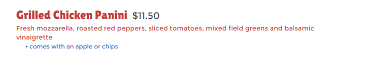
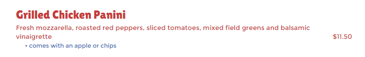
Normal For non-centered Menu Styles, the price is right justified and always placed on line 1. For centered Menu Styles, the price is centered and placed on a new line, after the item's description, unless any special layout options are set.
with Name For all Menu Styles, the price is added to the end of the food item name so it appears 'with' the name. This placement can also have the effect of 'hiding' the price but less so than the 'with Description'. This option is also available on a per item basis under the food item's Layout Tweaks section.
-- The following options use the preceding element's font rather the specified price font. --
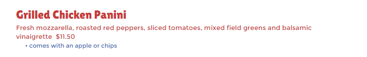
with Description For all Menu Styles, the price is added to the end of the food item description using the description's font so it appears 'with' the description. This placement, which effectively 'hides' the price with the description since it uses the same font and is not right-justified, is often used on menus to discourage 'price shopping'.
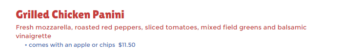
with Extras For all Menu Styles, the price is added to the end of the food item extras using the extra's font so it appears 'with' the extras. If the item does not extras, the price still appears where the extra's would normally appear, using the extra's font. This placement, which effectively 'hides' the price with the extras, can be used to discourage 'price shopping'.
follow Description For non-centered Menu Styles, the price is right justified and 'follows' the food item description, placed on the description's last line of text using the description's font. For centered Menu Styles, the price is added to the end of the food item description using the description's font.
-- The last option removes the prices all together, for the current menu. --
do not display For all Menu Styles, the price is not displayed. This option lets you save your food items in the food list with prices and also have the option of creating catering or special events menus with the same food items but with the prices omitted.
Places a currency symbol in front of each numerical price on your menu (Dollar Sign, Pounds, Pound Sterling, Euro, Yen, etc.). If you don't want currency symbols on your menu, choose none.
Places a leader character in front of your price, including the option to use leading price Dots.
Note Dots will only appear if Price Placement Normal is also selected.
Allows you to add an extra 1 or 2 spaces between Dots if you are using Dot leaders.
Changes just the decimal part of the price to a pseudo-superscript style. Works with Price Placement of normal or with name only.
Allows you to add extra space before the Dots start if you are using Dot leaders
Allows you to add extra space where the Dots reach the Price if you are using Dot leaders.
Normally the colors of the Dots will be the same color as the price. But if this option is checked, the color of the Dots (if Dot leaders are in use) will match the color of the food item name. This can create a dramatic presentation for the price if the price font color is different than the food item name font color.
For centered layouts, when the price placement is set to normal, this setting places the food item price after the Extras rather than after the item's description.
At any time, click the Use Style defaults button to use the Style's default Price Options.
For Normal Price Placement, this value sets the total amount of space that will be used for each price column if more than one price is being used for the item. In effect, it evenly spreads out the right justified prices of the item by allocating a set width per price column. (To use more than one price, simply enter your prices for the item separated by a semicolon, as in 10.95;12.95;15.95. iMenuPro will then right justify the prices on the same line with proper spacing so they line up in price columns.)
For example, if you want 1 inch total space for each price column, enter 1. If you want 3/4 inch, enter 0.75. If your prices are too close together, enter a bigger value here or decrease the size of the price font.
If you're using Normal price placement multi-prices, you may need to explain what each column means.
You can do this in two ways:
1 The first method is to use a right-justified subheading above the prices. To do this, add a heading of type Subheading and select the alignment of the heading to be Right. Then add the heading under your main heading and before the food items. You can enter any text you want in the heading such as:
Bottle Glass
or
Small Large
Example: Multi-price column descriptors using a right-justified subheading
2 Another method is to use a food item as a pseudo-subheading and in the price field for this pseudo item add the column descriptors, separated by semi-colons.
For example:
Food item price field [ small;medium;large ]
And leave the rest of the fields for this food item blank (so only the price field has text). Then drag this food item under the main heading so it describes the price fields for the food items that will follow. This method has the advantage in that the column descriptions will automatically align with the the prices since you are using the actual price field for the descriptors.
Example: Multi-price column descriptors using a food item
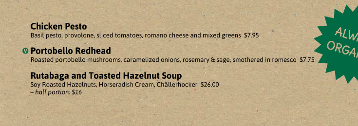
For any food item or heading, you can add a variety of food symbols such as ’ or , or ´ to highlight the item and draw attention. A trusted menu-engineering staple, highlighted items tend to see increased order rates, so you can use symbols to increase sales of high-profit food items too. Just don't overdo it - if all items are 'special' then none are.
Example using Large symbols
To add a food symbol, simply edit a food item or heading and select the symbol you want. The color of the symbols and relative size of the symbols are preset with the Menu Style but you can change those options with the Design > Symbol Options command.
The following options are available:
Sets the symbol color.
If checked uses a larger symbol than the normal size (the relative size of each symbol is based on the item it's next to).
If checked moves the symbols inline with the food item Name so they don't extend into the left margin. This option is useful if you have limited room in the left margin such as when using columns or when using a wide border. Note: Switching this option on/off can cause menu reformatting because the inline symbols take up part of the food item space.
Example using Keep inline
Example without using Keep inline
If you have Keep inline with Name checked, for certain menu styles you can also choose to have the symbols appear to the right of the item Name (normally they appear on the left).
Example with symbol on the right
Sets the horizontal spacing between symbols. The larger the value, the more space next to a symbol. Note: This setting applies to footer key symbols as well.
With Design > Chalkboard you can turn your entire menu into a faux chalkboard menu with a single click. Chalkboard style menus are trendy, great for specials or web promotions, and can even be used as your Live-Sync website or Facebook menu.
The most common chalkboard color is medium black but we've supplied a few other colors as well.
If you change your mind after clicking Chalkboard It, use Edit > Undo Chalkboard to return to your original design.
With Design > Colorswitch you can change all of your design colors at once. It's similar to the Chalkboard command but in this case your background remains unchanged, and you get to choose the design color.
If you change your mind after clicking Colorswitch Now, use Edit > Undo Colorswitch to return to your original design colors.
"The choice of particular hues is far less important than how they are combined into a delicate balance."
Donald Kaufman of DKC
Good color can create a mood, and even make your menu more appealing and appetizing. With iMenuPro's Menu Styles we've done the hard work for you – all color choices, fonts, accents, background, etc. are preselected for you. But they won't work for everyone. And it's fun to mix it up and think different.
Hence, the iMenuPro color picker which lets you change the color of almost every iMenuPro design element – even images. Just click the Color box option in the design element's window. The color picker appears allowing you to choose any color by clicking a color swatch, clicking in the color field, or using the color spectrum bar.
You can also enter a color's hex code or RGB value directly for branding to specific colors.
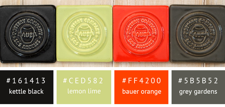
We used these vintage Bauer tiles as inspiration for the iMenuPro Brand colors
There are 16,777,216 colors available in the iMenuPro color picker. So sometimes its hard to know where to get started to find that perfect combination of hues. To help, we offer some great preset palettes as starting points. Just click Palettes in our color picker to see an expanded preset palette list.
You can use these palettes by clicking the color swatches, or as inspiration by clicking the swatch and then tweaking the final color in the color field or spectrum bar.
To hide the expanded palette list, just click -Palettes again.
iMenuPro includes over 2,000 Artisan images that can be added to any menu - royalty free. Plus you can add any number of your own images such as your logos or food photos to create your own image collection. Any image can be easily dragged to any spot on your menu and can be sized to any dimension. Artisan images can also be colorized.
To add an image (or picture) to your menu, use either the Insert > Artisan Image or Insert > Uploaded Image command. Once the Insert window appears, use the Browse button to find the image you want.
If you're adding your own images, you'll see an Upload Image button which will let you upload images from your computer to your own Image Collection where they can be accessed at any time. The image collection lets you manage all of your uploaded images in one place so you can search for the image you need and use the same image on multiple menus without having to upload it each time.
You can also drag an image from your computer directly onto the menu.
Dragged images also become part of your Image Collection so you can avoid duplicate drag-uploads.
Once on your menu, simply drag the image where you want it positioned. To resize, wave your mouse over the resize icon (lower right corner) and click and drag (or Shift-click and drag to free-scale proportion). For more precise editing, or if you're on a tablet, click (or tap) the image to edit it's dimensions, orientation, rotation, and if it's an Artisan image, its color too.

Use Shift-Click + drag on the resize icon to resize without proportion
Tip! You can also attach your uploaded images to a specific food item. You'll lose flexibility on sizing and placement using this method, but when the food item moves the image will move with it. To do so, edit a food item and select the photo to attach in the photo box.
The following options are available:
Check this box if you want the size of the image to maintain its original proportions.
The image's width.
The image's height.
The distance the image is from the left edge of your menu.
The distance the image is from the top edge of your menu.
The rotation angle of the image (use 0 or no for no rotation).
Check this box to flip the image vertically.
Check this box to flip the image horizontally, creating a mirror image.
You can change the color of some artisan images. Check this box and then choose a color. You can change the change the opacity of the images (lightness) also with the slider at the bottom of the color box. Note: If the original image has more than one color, this option applies a monochrome colorization to the image.
You can change the lightness of your uploaded logos, photos, pictures, or artwork to create your own background or watermark. To lighten an image, check this box and then choose a lightness value.
Examples of artisan images rotated and lightened
The Browse button lets you browse the Artisan image collection or your own image collection. Upon clicking the Browse button you're presented with a list of either Artisan Images or Uploaded Images. (For Artisan Images there is an additional View button to view the various collections available. For both Artisan and Uploaded Images there's a Search box as well to help you find the image you're looking for.
Uncheck this box and then click OK to remove the image from your menu.
Permanently deletes an image from your image collection. (Clicking any uploaded image in your image collection will give you the option to delete it.) If this image appears on any menus, it will no longer appear on those menus after it's been deleted. To simply remove an image from the menu, use the On Menu button instead.
Tip! You can also RIGHT-CLICK the image to edit it, center it, change its display order (front to back), change the page it appears on, or remove it from your menu.
Click the image and uncheck the On Menu box. Or (if you're on a computer with a mouse) right-click the image and select Remove from menu or hover over the item with your mouse and click the X in the upper-right corner.
Right-click the image and select Clone to create a duplicate image on the menu.
Right-click the image and select On top of text which will place image on top of text elements instead of underneath them.
Tip! If the menu text is cramping your style in regards to moving or placing images, just disable it by using View > Disable menu text. After your images are perfectly placed, you can re-enable the text using View > Enable menu text.
Floating Text is text that 'floats' over the normal automatic formatting of Menu Headings and Food Items. It's free form and free positioning. So it can be dragged and repositioned anywhere on the menu and is not affected by Page Spacing or Menu Style formatting. As such, it's most useful for incidental text that doesn't fit into the standard menu style format.
Use the Insert > Floating Text command to add floating text.
Use the Fonts > Floating Text to change the font, size, and color of your floating text.
When you edit floating text a Floating Text box appears with the following fields:
Sets the alignment within the block of floating text itself. The default alignment is Left.
You can select a box or accent for the floating text here. You can also change the accent's color using the Box/Accent Color selector. To remove the box or accent from the floating text select (none).
The distance the floating text is from the left edge of your menu
The distance the floating text is from the top edge of your menu.
Sets the line spacing within the floating text item. 1.0 is the default single spacing option.
You can set the overall size, font, and color for all Floating Text using Font > Floating Text but you can also tweak each individual floating text block to vary its size using the Scale Size effect.
The rotation angle of the floating text. Select none if you don't want the text rotated.
Restaurant name using floating text rotated 270° vertical up
Slogan using floating text rotated 355° tilt up
The curvaceousness of the floating text. Select none if you don't want curvy text.

'Authentic' using floating text curved up
You can set Alt Font to use to use the Alt-Font Floating Text font (set under the Font menu) instead of the normal floating text font. This allows you to have an alternative font family for some floating text.
Tip! You can use Floating Text as a watermark by clicking Fonts > Floating Text and using the opacity slider after clicking the Font Color button. If you select a very light opacity, the floating text will appear as a watermark.
Example using watermark Floating Text
The footer appears at the bottom of your menu below the bottom page margin. Footers are useful for any text you want at the very bottom of every page of your menu such as food safety warnings (consumer advisory), gratuity guidelines, copyrights, disclaimers, your chef's name, restaurant website address, etc.
Use the Insert > Footer command to add or remove the footer.
Tip! If the footer is already on the menu, just click it (or tap) to edit.
When you edit the footer a Footer box appears with following fields:
The text for the footer such as 18% gratuity added to parties of 6 or more, or Today's Specials prepared by chef Don Draper, etc.
Footers can match the font and size of either subheadings or the Alt-font or Alt-font-2 heading types. So if you need to change the footer size or font, select one of the three and then change the font for that heading type under the Fonts menu.
Sets the alignment for the footer. The default alignment is Center.
You can select an accent for the footer here. You can also change the accent's color using the Accent Color selector. To remove the accent from the footer select (none).
If checked, certain graphic accents like solid boxes or underlines will span (stretch across) the entire page including the left and right margin areas.
Example of footer with solid box accent spanning page
Symbol icons appear in front of the footer. To use a symbol with the footer, click under Symbols and select a symbol from the list or choose none to remove the symbol. If you use both symbols, the symbol on the left will appear to the left on the menu.
NOTE Footer Key: If you are using lot of symbols on your menu (for allergens, allergies, preparation methods, etc.) and need a key to explain their meanings, you can use special codes that embed the symbols within the footer text. Here's how: When the symbol list appears a Convert codes option also appears. Checking this option will cause iMenuPro to convert the codes in parentheses into symbols within the menu footer. For example, to have a footer like this:
’ denotes Hot and Spicy and ´ denotes Vegetarian
use the Convert codes option and enter (28) denotes hot and spicy and (47) denotes Vegetarian for your footer text
Set the spacing between the bottom page margining and the top of the footer. To move the footer down, enter a larger number here. To make the footer start right where the bottom margin ends, enter 0.0 here.
Tip! If you have a border on your menu, depending on its margin and thickness, it may clash with the footer. So if the footer ends up on your border (or too close to it) you can move the footer by changing from Margin or you can move the border by changing its margin using the Design > Border command.
Normally a footer on the menu will appear on all pages. You can use this field to remove it from certain pages. Just enter the pages here, separated by commas, where you want the footer removed.
Automatically formats line breaks for you. Normally you'll want to leave this box checked for headings and food items, but for your footer, it's sometimes useful to turn it off so you can have multiple lines and control where they wrap.
The On Menu checkbox is used to add or remove the footer from the menu.
To put the footer on the menu, check the box and click OK. To remove the footer from the menu, uncheck the box and then click Ok.