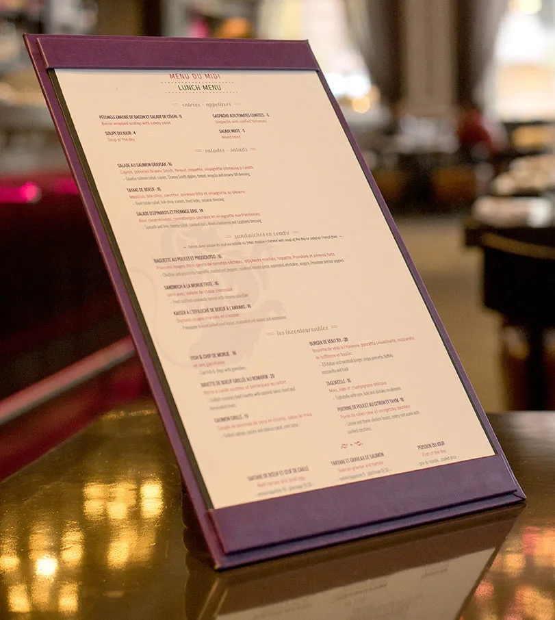
Single page lunch menu from Suite 701 in Montreal, created with iMenuPro
For most cases, it’s better that your customers see everything at once - the whole enchilada, i.e, all the menu items on a single page.
So if you have lots of menu items, choose a bigger page size, and use columns. But anything more than a large tri-fold (3 column menu) is going to be too big.
Old, bulky menus are a thing of the past (especially with the acceptance of QR menus) - modern diners don’t want to process multiple pages, let alone flip though a book. So they’ll give up and order something they might not want, and therefore might not return. You both lose.
So keep your main menu to a single page (two max) if possible. You can do front and back (main on the front, beer and wine on the back) or a classic menu cover which opens to a left and right page. But if you have to push it to more than that, you may want to re-think your menu.
Exceptions here include specialty restaurants such as classic diners or certain themed restaurants, or restaurants with large wine lists. But even a large beer list (over 100 beers) from today’s trendy hot spots can fit on an 11 x 17 page.
In today’s web-enabled world, people don’t want to read a novel, so keep it to a single page and you’ll be happier you did.

Single page lunch menu from Suite 701 in Montreal, created with iMenuPro