Use these menu design tips for higher profits.

“Successful people make adjustments.”
Evander Holyfield
The following sections can help you build a more profitable menu and in turn make us more profitable since we make the leading menu app for creating menus — iMenuPro.
But even if you don't use our software, the secrets and tricks of the trade here stand on their own. You'll just have a much easier and more delightful experience implementing them if you use our app.
The key to good and practical menu design is not only creating something to entice your customers, but being practical and flexible. Namely, allowing for changes that will inevitably occur within your establishment due to a variety of conditions - changing food costs being a major one.
“by redesigning your menu, you can increase business up to 10 percent. A great menu does not have to be costly. If you take all the factors into account and create a simple, informative menu, that's really all you need. Restaurants today need to make their menus dynamic and add new things to keep customers interested, and take things off that customers don't order.”
Pizza Today Magazine
It's simple advice. And almost no restaurateur would disagree. But the cost and hassle of making those menu changes can get in the way of clear thinking. So many menus, which are a restaurant's most vital selling vehicle, stay stagnant with potential profits lost.
For quick tips on how to keep your menus fresh, check out the other articles here.
Where applicable we'll also tell how to achieve the goal using iMenuPro.
i Change. Don't be afraid of it. Time. Don't waste it. Menus. Don't take much time to change with iMenuPro.

The almighty price is a big factor on menus, not just the value itself, but how it's presented. Here's a few strategies to consider:
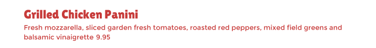
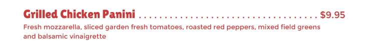
1 Price Point Justification Move your prices into your descriptions to avoid price-shopping by customers. Using the same typeface (or slightly smaller) and removing the dollar sign can further help the customer focus on the product, not the price*.
*Based on a published in the International Journal of Hospitality Management (28:1).
In a nutshell, without the dollar sign, the monetary value of items have less weight, and diners will spend more.
2 Anchors Away Basically the theory goes, have a very expensive item next to cheaper high-profit items, to make the cheaper ones seem cheap by comparison. This increases sales of the cheaper high-profit items.
Price "anchoring" comes from a cognitive phenomenon discovered by psychologists Daniel Kahneman and Amos Tversky in the 70's. It asserts that when we try to estimate a numerical value, we are unconsciously influenced by the related numbers around it. If you've ever been to a Prada store, you'll be familiar with this technique already.
3 Above 5, add 95 Since pricing increments of less than $1 don't change the value of perception, for an item that is priced at more than $5 add $0.95 on any item that's more than $5. For example, since $13.50 and $13.95 have the same perceived value, go with $13.95 to maximize your profits.
4 Follow the Leader In regards to removing the leader dots (the dots that lead up a price) while it was fashionable in the 90's to remove these, the trend now is moving back towards retro-style classic menus. And the limited studies done on price placement makes this option worth considering, especially if your restaurant appeals to younger diners. There's something comforting about the old school approach and younger, more savvy diners on are already hip to price tip number #1 and appreciate the honesty of classic leader dots.
i With iMenuPro, whichever pricing layout you choose, you can swap it into any Menu Style we offer using the Price Options feature.
For most cases, it's better that your customers see everything at once - the whole enchilada, i.e, all the menu items on a single page.
So if you have lots of menu items, choose a bigger page size, and use columns. But anything more than a large tri-fold (3 column menu) is going to be too big.
Old, bulky menus are becoming a thing of the past (especially with the acceptance of QR menus) - modern diners don't want to process multiple pages, let alone flip though a book. So they'll give up and order something they might not want, and therefore might not return. You both lose.
So keep your main menu to a single page (two max) if possible. You can do front and back (main on the front, beer and wine on the back) or a classic menu cover which opens to a left and right page. But if you have to push it to more than that, you may want to re-think your menu.
Exceptions here include specialty restaurants such as classic diners or certain themed restaurants, or restaurants with large wine lists. But even a large beer list (over 100 beers) from today's trendy hot spots can fit on an 11 x 17 page.
In today's web-enabled world, people don't want to read a novel, so keep it to a single page and you'll be happier you did.

Single page lunch menu from Suite 701 in Montreal, created with iMenuPro
If you draw a line around it, people will see it (and order it). There's no single better way to draw attention to a high-profit menu item.
Impact 10 to 15 percent of the space on your menu by boxing menu items. As a general rule box 1 out of every 8 to 10 items. Boxes draw attention and get orders. So its best to use them on high-profit items. Too many boxes creates clutter and defeats their attention getting purpose.
Grab their attention with a colored box
A similar trick can be achieved by adding symbols before your menu items like NEW or Local. Going all the way back to the father of modern advertising, David Ogilvy, "People want news", and what's more news-worthy than a new dish.
Food symbols draw attention to high-profit items
i With iMenuPro you can box a single item or any group of items. To add NEW in front of a food item, just edit the item and choose from one of several NEW icons from the symbol list. Both tricks take but a few clicks and won't change your menu layout.
Offering daily specials at your restaurant can set you apart from the competition and help define the character of your establishment. It can also increase your profits.
Since diners expect to pay more for your signature dishes, you should be able to charge more for a special without impacting sales. In fact, sales should increase as much as 15% for items offered as specials, simply because they are being singled out.
Here are two tips that might help:
1 Don't recite it, type it This one may seem obvious but many restaurateurs don't realize that specials should be printed rather than recited. The recitation of specials by your servers with follow-up questions from your customers can take up to 15 minutes or more. This is valuable time that can be better spent on improving customer service. It's a rare individual who can verbally outsell a printed menu.
Plus, many customers resent the salesy monologue and few can remember more than a few specials. Most will be be reluctant to ask questions. Offering an 'up-sell' suggestion or two about a particular special is not a bad idea, but reciting the entire list is.
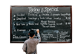
The specials should appear on a menu insert or menu page that is separate from your regular menu to further distinguish them and to facilitate daily or weekly changes. Blackboards are cool and quaint but many diners miss them and they require considerable effort to maintain.
2 Pitch desserts and beverages under a tent If you operate a restaurant where table tents are appropriate, consider using them for dessert and beverage specials. Table tents used in this fashion can double sales from these two highly profitable categories since they continue to "sell" after the regular menus have been taken away.

i With iMenuPro a stylish daily specials menu can literally be created in under a minute. Many of our customers use it soley for that purpose. For table tents there's a built-in Table Tent Creator tool that creates 4-UP table tents from any menu with a single click.
Menus with fancy fonts can mean fancy prices:
excerpts from Reuters and Time Magazine
Restaurants using fancy typeface on their menus can often get away with fancy prices too, because people perceive complicated fonts to mean complex foods that need greater skill to prepare according to a U.S. study.
Researchers Hyunjin Song and Norbert Schwarz, from the University of Michigan writing in the October issue of Psychological Science have concluded from research that small changes in the fonts on a menu can significantly alter people's perception of the food they are ordering, including its value.
"People infer that if something on a menu is difficult to understand or hard to read that it takes great skill and effort to prepare," says Song. Likewise, Song reports using an offbeat font to obscure a dish's description may signal hidden value to an unsuspecting diner on unfamiliar ground.
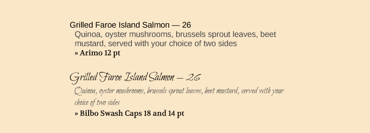
Plain vs Fancy: which looks harder to prepare?
This would explain the logic and trend of restaurants offering exorbitant entrées printed on menus with scripted fonts in microscopic print. So commonplace is this trend, that some restaurants in New York City now offer reading glasses for diners who need them. They do so, not because their menus are poorly designed, which they are not, but because some guests, particularly those with declining visions, are now used to using reading glasses to read menus with fine print.
Song's experiments compared subjects responses to identical menu item descriptions in the font Arial (a standard Windows font) and the harder-to-read Mistral font. Subjects in the latter case were more likely to conclude that the dish required great skill and was harder to prepare.
Song reports that, based on her findings, she might recommend that if restaurant owners want to give consumers the impression that their food is complex and of special value, they should consider styling their menus accordingly.
Not everyone is in agreement with Song's findings. Some restaurant marketing professionals believe fancy fonts, although they suggest sophistication, can also be pretentious and unapproachable. They argue type that is readable can boost sales for certain types of restaurants, including those that serve primarily organic food, where customers tend to value an easy-to-read font more highly.
i With iMenuPro, fonts are pre-selected with a Menu Style but you can override any pre-selected font using the Fonts menu. There are dozens of "fancy" fonts to choose from including Bilbo Swash Caps featured above.
Menus with handwritten typeface boosts social media posts:
2019 Ohio State University study
A found that diners eating in health-focused restaurants are more likely to link the restaurant to healthiness if the menu features handwritten fonts.
The study also found that these types of menus are more likely to generate posts (photos of the foods served there) on social media sites such as Instagram, Twitter, Yelp, etc. More posts means more positive interactions with your customers and, in turn, drives more foot traffic to your business.
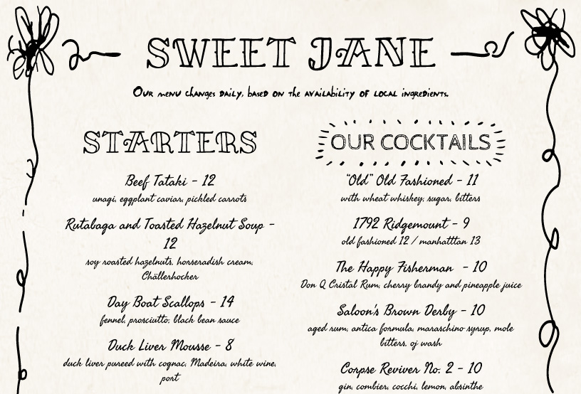
Example of an iMenuPro menu with handwritten fonts
The results show that these positive effects occur only when used in establishments where the menu is health-focused. So if you run a burger joint, the folksy handwriting fonts won't help you. But if your focus is on healthy eating, "writing" fonts and hand drawn art should definitely be considered.
i With iMenuPro, you can swap preloaded handwritten fonts into any Menu Style. There are many hand-drawn typefaces to choose from. And typewriter fonts, which achieve the same sort of "human touch" effect, are included as well.
“Menu language, with its hyphens, quotation marks, and random outbursts of foreign words, serves less to describe food than to manage your expectations.”
Sara Dickerman
According to cook, chef, and noted food writer Sara Dickerman, menus are "the Pavlov's bell of eating out". Sage words from someone who has spent a good deal of her life immersed in all aspects of food preparation and dining, and has received the prestigious James Beard award for writing about food.
In a nutshell, Menu English can manipulate and has the power to sell - to convince or sway a diner to opt for one dish over another. But how does it work and what makes it so persuasive?
While we can't provide the definitive answer, we can offer some helpful tips and strategies to get you started in the right direction. Ultimately, much of what your restaurant is all about will determine what type of copy you should write. So take these tips with a grain of salt - a fresh, grain of sea-salt.
1 If you're not Shakespeare, then don't be. Good menu copy doesn't have to be poetic or dramatic - more often than not, the simpler the better. It doesn't even have to follow the rules of grammar. So don't be intimidated into thinking you need to be a professional writer. No one knows your food better than you do. Honesty is the best policy. You'll be fine if you honestly, and most often plainly, describe what's on your menu. Erring on the side of simplicity will do you right.
2 Consider Traffic Jamming. If you are writing menu copy in the U.S., you should consider a technique coined by expert food writer Sara Dickerman called "Traffic Jamming." Summed up, it means spelling out almost every ingredient in the dish, pandering to the finicky and obsessive culture of American diners who desire to micromanage their meal by scrutinizing the ingredients. Kind of like the Starbucks of menu writing. As an added benefit, it convinces diners they are unlikely to replicate the dish at home, thereby justifying a higher price. Consider this offering from Proof Restaurant in DC: "Roasted Scottish Salmon - caramelized cauliflower, filet beans, mushrooms, potatoes, fennel cream." Not many folks are going to caramelize their cauliflower at home or whip up a quick fennel cream. Of course, this technique is more suited to upscale dining. If the dishes you serve are simpler, stick to the basics. The honest, minimalist approach is equally effective.
3 Don't scare the anxious diner. Kind of like the everyman's version of "traffic-jamming", chain restaurants employ this strategy often. It boils down to having any type of menu item name, even a funny or cute non-descriptive ones like "Sally's Bitchin' Burger", but making the menu item description as specific as possible often down the exact size of the portion. Also important here, the description should be void of any hard-to-pronounce, intimidating foreign phrases that might dissuade the customer from ordering the dish out of fear of embarrassment. An added benefit of this technique - it reassures the worried diner there won't be any surprises or strange exotic herbs they can't stomach. The "perfectly grilled" 1/2 pound double-cheeseburger will have exactly "two slices of American Cheese on top, catsup, yellow mustard, no lettuce, with 3 pickles on the side".
4 Be a Descriptive Fresh Face. It should be assumed that in good restaurant everything is fresh. So why would so many menus display this, and why do chefs feel the need to point this out by including the words "fresh", "market", "seasonal", "gourmet", and other synonyms throughout their menu copy? Because in America, it works. Trends in advertising come and go, but presently we're riding a wave of organic goodness all the way to the bank. So it probably wouldn't hurt to include at least a few of these words and phrases in your menu item descriptions. In fact a done by Dr. Brian Wansink found that menu items with sensory descriptors such as "tender" and "succulent" or cultural terms like “Italian” and “Cajun” or nostalgic terms such as "homestyle" and "traditional" versus the same items without those words increased sales by 27%! Too much of a "fresh" thing though and you'll lose your patrons trust. So don't overdo it.
5 The Honest, Modernist, Minimalist. Most diners realize that menus are selling tools. So to persuade them otherwise, especially in these times of marketing through anti-marketing, try listing your dishes for what they are with no hyperbolic descriptive copy. This strategy caters to the jaded crowd but also appeals to younger diners who have grown up through the age of over-the-top marketing. It also makes sense if you're having trouble pulling off the other strategies.
6 Proofread and spell-check. Every writer is guilty of typos now and then. But a menu littered with misspellings may signal to your patrons that you probably also lack an attention to the details of your foods. If you want to demonstrate culinary flair in your descriptions, with exotic terms or foreign phrases, (80 percent of which are usually French by the way) then go for it. But just make sure they are spelled correctly.
7 I'm CAPS and you're not. Being consistent with your use of upper case letters. Whether starting menu item names with capitals, or capitalizing the whole name, or even the whole menu item description, not only effects your menu copy but also plays a role in your menu design. Caps are louder, bolder. All lower case and you're announcing with understated confidence what fine delicacies await the hopeful diner. Whatever method you use, stay consistent. Don't capitalize one menu item's name and not another. Also, concerning the use of punctuation and specifically the period - if you end a food item's description with a period, then end all food item descriptions with periods.
In the end, write what feels natural, re-write until you're satisfied, and get opinions - even from your guests - as to whether your menu copy sounds appetizing and appealing, and accurately describes your fare or needs a re-write. But don't ignore this important aspect of your menu design, as it can have a significant effect on your bottom line. Good luck and bon appétit!
i iMenuPro can't write your menu for you. But it can make it super easy to update and edit at any time. Simply click anything on your menu and edit the text - it's that easy - the formatting is all automatic.